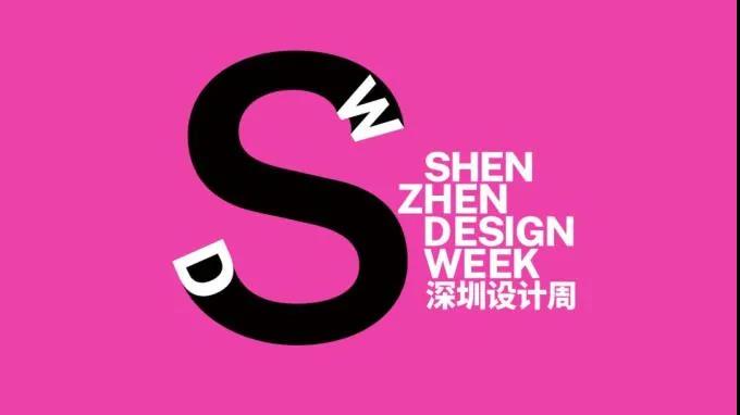
SZ unveils new logo for design week
A new logo for Shenzhen Design Week was unveiled by the organizer Friday.
The logo, with the event’s acronym as its new visual symbol, features a capital letter “S” with the letters “D” and “W” embedded at the beginning and end strokes.

The logo’s main color is the city flower — bougainvillea blossom’s bright color, which symbolizes the city’s charm, vitality, dynamics and innovation.
Shenzhen Design Week, an important cultural event in the city, will be held between Dec. 25 and Jan. 3 at UpperHills in Futian District, the organizer, Shenzhen Municipal Publicity Department, announced Friday.
The design week will gather more than 20 participating units and dozens of well-known designers in the Guangdong-Hong Kong-Macao Greater Bay Area. It will be developed in the form of one main venue and satellite venues. Design associations, cultural enterprises and independent designers will gather at UpperHills, the main venue. Various activities will be held at satellite venues such as Shenzhen Book City, Bay Opera of Shenzhen, Shenzhen Bay MixC Arts Gallery, OCT Creative Exhibition Center, Sea World Culture and Arts Center, OCT-LOFT, Dapeng Fortress and Nantou Ancient Town.
The design week, themed “Design as Solution,” has five core sections namely Resilience, Fusion, China Cool, Horizon and Utility. It will present the value of integrated design in solving problems, enabling urban administration, especially in megacities like Shenzhen, bridging intercity integrated development, carrying on Chinese cultural traditions, endowing design values and improving design innovations.