Aspiring designers illustrate amazing Asian aesthetics
1983Asia.mp4
During the same time little Yong Siong Yow was being enchanted by the costume design of “Saint Seiya” at his home in Malaysia, dreaming of becoming a painter when he grew up, Su Su, a little girl in North China’s city of Tianjin, was absorbed in the fantasy world portrayed in Chinese animation film “A Deer of Nine Colors.”
Asian comics and animations led both to a life path in design, while the desire to explore the possibility of design from the perspective of Asian culture brought the two, both born in 1983, together as a team.
“The concept of design had originated in the West,” said Yong during an interview with Shenzhen Daily. “As different cultures have different aesthetic views, if we look at design from the perspective of Chinese culture, we may find different rules for design. That’s why we decided to focus on local culture when we founded the studio 1983Asia.”
Established in 2012, 1983Asia specializes in brand, packaging and mascot design as well as art crossovers that render traditional Asian culture and aesthetics into modern visual expressions.
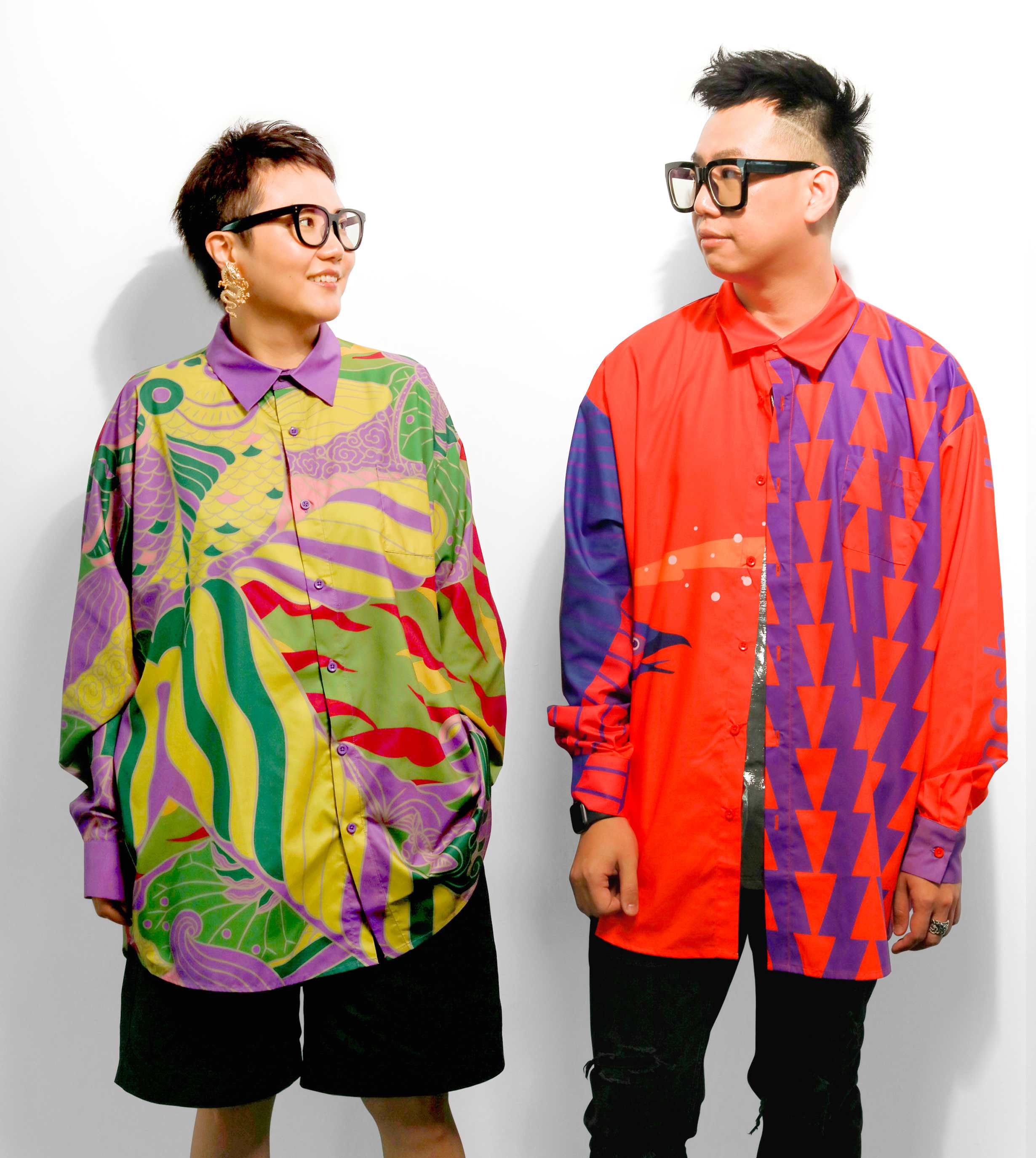
Yong Siong Yow (R) and Su Su. By courtesy of 1983 Asia
They have received multiple international awards including the Design for Asia Awards, Hong Kong Design Association Global Design Awards and the A’Design Awards. Their works have also been exhibited in London, Milan, Moscow, Tokyo, Seoul, Taipei, Hong Kong and many other cities. From 2016 to 2018, their exhibition themed “Amazing Asia” toured around Macao and Taiwan’s Kaohsiung and then in Shenzhen in 2020.
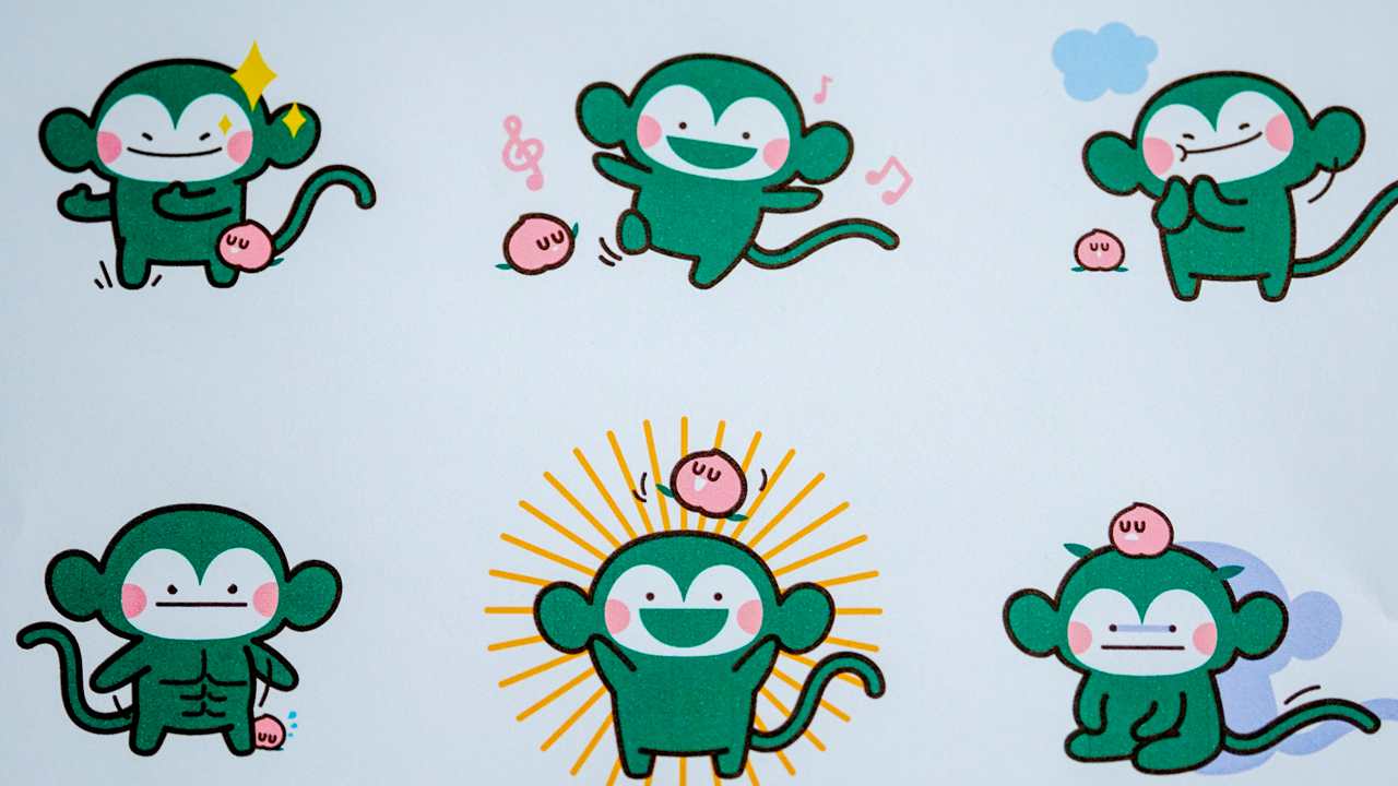
If you’re a fruit lover, you must have at least once visited a shop of the Shenzhen-based Pagoda fruit retail chain, and you may have noticed the logo of the fresh fruit chain — a happy green monkey dancing with a smiling pink peach on its head. The logo, teeming with life and energy, was a work of 1983Asia as part of a brand renewal project entrusted to the duo by Pagoda.
Before the renewal, the old Pagoda logo featured a proud monkey holding a peach, highlighting the quality of the fruits it sold. After years of development, the brand has also added respect for nature as a key part of its brand values. During the design process, 1983Asia has brought in a traditional Asian philosophy about life — a belief that everything has a living soul. Instead of being the monkey’s food, the peach has become its friend, a change that also accentuates Pagoda’s developing brand values.
The new Pagoda logo designed by 1983Asia. Wang Haolan
To create more fun and give more possibility to the logo, the designers also introduced the 24 solar terms to the renewal. “The idea is that the monkey is a fairy highly sensitive to seasonal changes,” said Yong. “Its body wears different colors in accordance with seasonal changes of climate, and the peach character on its head can also be replaced with other kind of fruit. In this way, the brand identity is more than a single logo. It has become a visual system that evolves with vitality.”
Similar to what they did with the Pagoda brand design, 1983Asia also utilized an ancient Chinese cultural concept in the brand and signage design for Nantou Ancient Town, a project that they worked on with Hong Kong designer Freeman Lau.
The designers began to work on the project in the second half of 2019 and spent half a year conducting field studies and research on literature. During the research, an old map that marked different gates at different directions inspired them to bring in the concept of “five basic colors.”
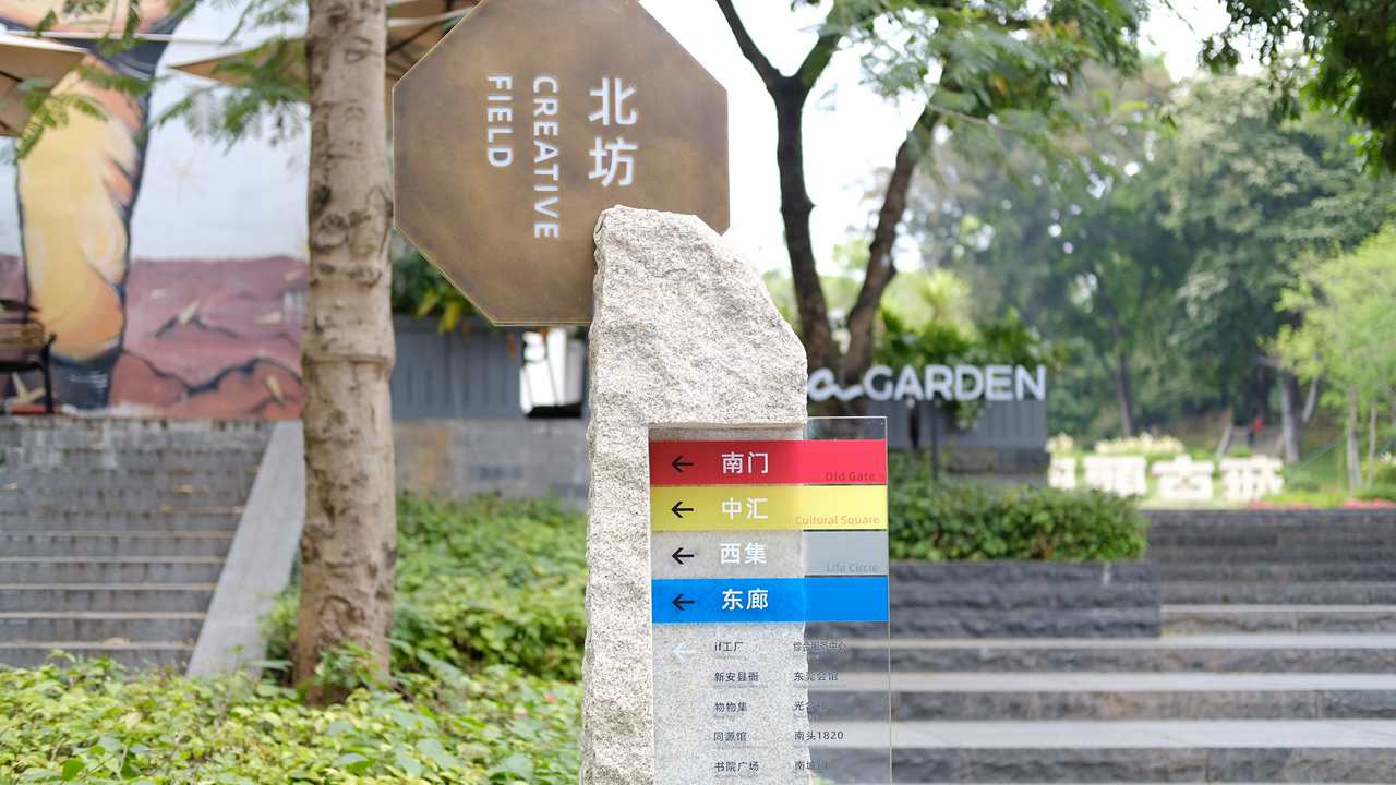
Wayfinding signs in Nantou Ancient Town. Lin Lin
In traditional Chinese culture, the five basic colors refer to black, red, qing (a mixture of green and blue), white and yellow, which correspond to the five elements of water, fire, wood, metal and earth in traditional Chinese physics. In the instance of Nantou Ancient Town, the designers used blue, white, red, black and golden to represent the five directions of east, west, south, north and the center while integrating symbols of the three main local cultures, Cantonese, Chaoshan and Hakka, into the design.
The project was not the first time for the duo to play with colors. They believe bright colors convey a sense of happiness and passion and symbolize a state of fullness that is cherished in Asian culture. In 2018, the duo started their own fashion label “mash up!!!asia,” which features shirts that often mix and match bright colors with patterns inspired by Asian culture, such as traditional Asian weapons, legendary creatures from Chinese mythology, and totems of the ancient Chinese royal court.
In their eyes, traditional culture never loses its power. It is hidden in the genes of everyone growing up in the culture. “We believe that designers are like translators. We unveil what’s concealed and convey it to people through visual expressions. In this way, we hope to show to people what design can be if it’s created by modern Chinese and Asian designers,” said the duo